
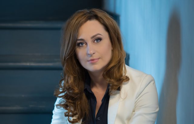
Angela Coman (Belle Maison Spa): “We opted for a modern, contemporary font, in line with our spa concept”
The end of the year brings a new image for Belle Maison Spa, located in Bucharest’s busy city center. AdHugger.net was curious to find out more about the strategy behind the change and what is the spa proposing on the local market, therefore we talked with Angela Coman, co-founder Belle Maison Spa. More pieces of information in the interview below.
AdHugger: What made you decide to change the spa’s image at this time?
Angela Coman: It is not the first time Bella Maison Spa is going through an image change. This time around it was a decision we took some time ago. It was a natural step in our evolution as a brand and business, as we evolved and grew. We celebrated 10 years of experience in the art of the massage and well-being and that is a threshold worth highlighting. We’ve always wanted to become better and better and once we got to better know our clients and their needs we were able to create a long lasting strategy.
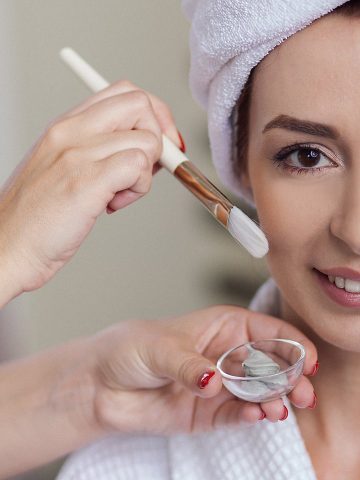
Another reason we chose particularly this moment was that we also have the financial resources to put our plans to work. Belle Maison Spa has now become a 5 stars day spa (a positioning also validated by the excellent reviews we received lately), where our clients can express their wishes and we do our best to accommodate them. For me, the Belle Maison Spa of today is a dream come true.
AdHugger: What more does it represent for you thing change?
A.C.: For me this change came naturally, because I have always been the practitioner of the organic growth. I am the type of person that is a blend of creativity and strategy and that likes to build long-term. The new spa’s image is the result of the respect I have for the people I work with and the guests we have everyday. We will soon reach the millstone of 10.000 happy clients.
AdHugger: Please tell us more about the graphic image.
A.C.: We opted for a modern, contemporary font , in line with our spa concept. The letters are without serif,therefore going away from the idea of classic. We wanted the people to think about handwriting, the human touch that we are going for at the spa. The colors are pink and gold. The pink translates the idea of femininity, but at the same time, I discovered that is the oldest color in the world and it has an amazing story behind it. Together with the gold brings refinement, warmth, optimism.
AdHugger: What does this change bring with it?
A.C.: It takes you to the idea of living in the moment, of putting you on the first place and understanding that only be investing in oneself one can achieve the results wanted, both in the professional and the personal life. I look better, I feel better, I give better energies around and I attract what I want and deserve. Our new headline is “Amour.Beaute.Serenite” and it expresses very well what we are trying to transmit to our clients. We believe in the power of now and in mindfulness. Concepts that are real for us, not just words.
AdHugger: What are your plans for 2020?
A.C.: In 2020 we will continue to put the client in the center of our universe and take care of him the best possible. Total focus on him /her. “Take care” and “I care about you” will be the next year’s central words. The massage, the pampering, the relaxation are not fads, but a must that contributes to our health. We will love to continue in that direction and do even more than before.