


Brand studio Saboteur has unveiled a radical new rebrand for financial data company Quant Insight
Quant Insight – Qi – is an innovative newcomer to data analytics. They use mathematical models from the science of astrophysics to decode the massive torrents of macro data that flood through the financial markets every minute of every day. It’s an inspired move – astrophysics is the art of finding patterns and connections in complex systems with billions of moving parts. So what happens if this science is applied to the financial markets?

It is, like all great ideas, brilliantly simple. So much so that you have to ask “Why hasn’t someone done this before?”
But no-one has. It’s a radical new idea that demanded a radical new design.
Mahmood Noorani , the founder and CEO, knew that he wanted something different. He wasn’t sure what it was, all he knew what that it had to be something that he hadn’t seen before.
And he isn’t afraid of new ideas. He was the one who approached Michael Hobson, Professor of Astrophyics at Cambridge and world-famous in his field, with the idea that they explore the financial markets together.
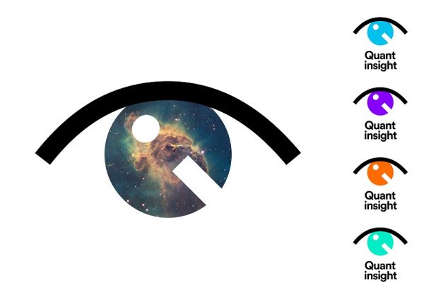
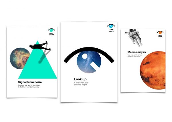
Saboteur started by identifying Quant Insight’s core brand idea and narrative. It quickly became obvious that such a radical new idea should be expressed in a brand that didn’t look or sound like anyone else. They developed ‘Look Up’ as the brand’s strategic heart.
Phase two was the translation of this into a new visual identity, including logo, typography, colour, imagery, original photography and a new brand website. The style Saboteur developed is (accurately) described as ‘gravity-free design’, where none of the normal rules apply. Dynamic, iconoclastic, and at the same time, clear and simple. Once again, the style raises the familiar question: why hasn’t someone done this before?
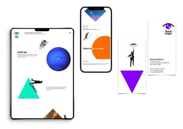
The redesign has the flexibility to be used to pivot Quant Insight to a B2C proposition.
Mahmood Noorani, CEO, Quant Insight, said:
“When astrophysics is applied to financial data, something extraordinary happens. You can see patterns where others often find confusion and you can make precise and accurate decisions instead of relying on ‘educated’ guesses.
“We needed a brand redesign that could capture and reflect the way we are pushing boundaries in the financial data world. Saboteur was able to see our vision and have translated our complex world into something eye-catching, brave and elegant. A brand redesign which is out of this world.”
Alex Clegg, The Dreaming Saboteur, said:
“The financial sector is instinctively conservative. “Websites can look like they were designed in Excel – Quant Insight were clear from the beginning that they wanted their brand to be as different as the pioneering technology they’ve created.
“Elements float and drift in a seemingly random fashion. But, of course, there is pattern here. All you have to do is look up.”
Saboteur is a brand studio that launched in pre-COVID days, so it now feels like it has been around for a century. Saboteur has a dozen clients, from small local charities to some of the biggest corporations in the world. Saboteur’s declared mission is to Set Brands Free and that message seems to resonate right across the spectrum.