


DDB Paris brings to life the world of Play-Doh
But first, “In the World of Play-Doh” is a press & poster campaign in line with the new communication platform that the brand launched worldwide for its 60th anniversary, last year. A platform focused on one word: « imagination ».
In a world of apps and digital entertainment, DDB Paris wanted to show that Play-Doh is still a wonderful way for kids to express themselves and develop their imagination.
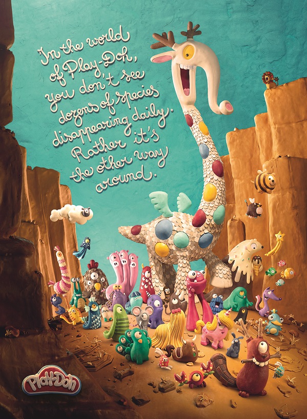
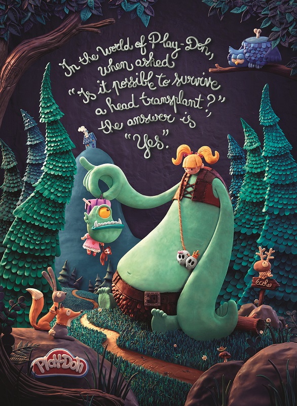
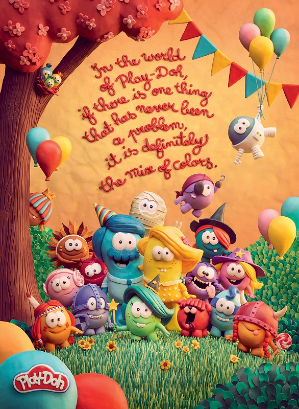
So, the creative team started with a very simple, yet universal idea: when kids play – and especially when they play with something like modeling clay – they build their own stories. Their own world, where anything is possible, even if it totally contradicts the laws of universe. That is how the « World of Playdoh » was born. Then it simply had to be explored.

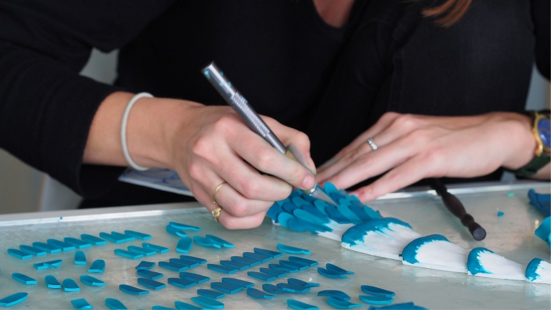
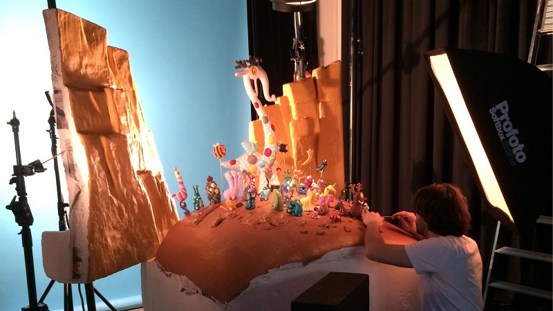
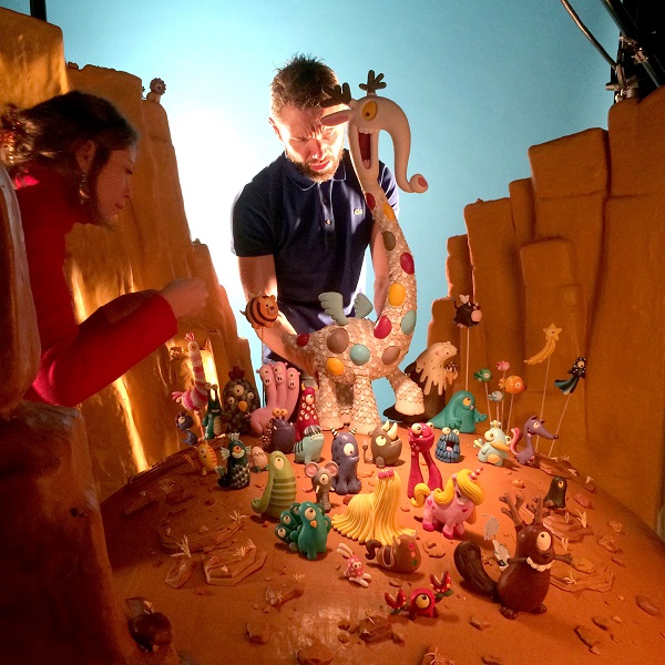
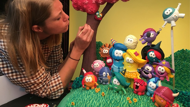
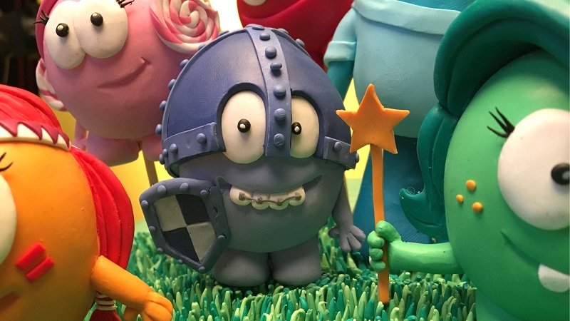
It started with some dozens, then hundreds, then thousands of drawings, to shape every character, every animal, every detail. It followed with a huge work on colors, to be sure of every piece’s tone. Then came the time to model clay and it changed a few grown-ups into kids. Months of extremely precise, yet joyful work, for each visual, tagline and logo. Finally, every piece was shot in studio by French photographer Marc Da Cunha Lopes.
The craft was as important as the idea. Every square centimeter of the ads had to be 100% Playdoh’s DNA. The image, the typo and even the logo are all hand made.

In such a manner that not only kids would be amazed, but their parents as well.
Because the strategy was to talk to parents as much as their children. Parents are the ones who can decide what is good and what is not for their own kids. And it was important to remind parents that sometimes the most ‘low tech’ toys are the best for their children.
Like any long-feature animation film made by Pixar or Dreamworks, this campaign is aimed to the family. Everyone can find something they like. The style was intentionally childish and colorful, as a clear reference to the children’s universe, and it is obviously attractive to the young ones. But the tone of voice adds something aimed to the adults as well. The headlines are written to have multiple layers of meaning for kids and parents.
Credits:
- Executive Creative Director: Alexander Kalchev
- Art Director: Emmanuel Courteau, Natacha Olive de Cherisey, Rémi Picard
- Copywriter: Jean-François Bouchet
- Account Supervisors: Marie-Laure Dangeon, Camille Passot
- Client Team: Hélène Kurz, Karine Martinez, Sylvaine Gomez
- Clay Modelers : Natacha Olive de Cherisey, Emmanuel Courteau, Rémi Picard, Marion Dervaux
- Photographer: Marc Da Cunha Lopes